How To Use Color to Get More Clicks, Repins,
Page Views, Blog Traffic, and Sales
How to draw attention to your Pinterest pins with color
You need attention-grabbing pins to stand out from other pins, get people to click on your pins, and drive traffic to your site.
To create effective pins, you need to use color, images, text overlay, and design.
Here are some tips on using colors to draw attention to your pins and make your pins stand out.
How Colors Affect Us
Color can have a profound impact on your viewers and prospective buyers. The wrong colors can negatively impact your pin clicks, page views, and sales while the right colors can trigger positive emotions motivating your visitors to click on your pins and buy from your blog.
Color can affect how we feel and influence what we think. In general, bright bold colors tend to stir us up, while the softer pastel colors calm and relax us. Responses to colors can vary by age, gender, and cultural background.
The colors you use in your Pinterest pin will affect how viewers react to your pin. That's why you need to carefully select your color scheme for your Pinterest images and your blog.
How to Use Color to Get Your Pins to Stand Out
Here are some guidelines to help you make good color choices. Keep in mind that these are guidelines and that there are no hard and fast rules.
- Target your audience. For example, if your target audience is women, then choose soft, pastel colors. If your Pinterest pins primarily target men, then you will want to use strong, bold colors. If your focus is on children, choose bright, vibrant colors.
- Choose colors and images that are appropriate for your niche and topics. For example, green may work well for information about starting a home business, making money, and reducing debt.
- Use colors that match or complement the color scheme of your website or blog.
- Limit the number of colors to two or three. This does not include photographs that can have a whole range of colors.
- When using photographs on your Pinterest pin, use colors in your text overlay that complement the primary color in the image.
- Make sure that all the colors you use work well together and don’t clash. Identify complimentary colors by looking across the color wheel (see resources below).
- Communicate your message with easy-to-read text. Use colors for your text that contrast with the background color so your text is readable. For example, a dark font on a light background is easy to read.
- Different audiences, niches, and topics get different results. Just use common sense. Testing will tell you what works for you. Test different colors and images for your pins.
Try Tailwind with the free Tailwind trial.
What Your Colors Say About Your Pins and Your Business
and how you can use color to get more pins and repins
Consider the mood you want to create. Colors elicit emotions. Emotions trigger sales. People buy what they want – not what they need. The list below will show you how colors can affect us in different ways.
The Shortstack website has an infographic about the psychology of colors.
They mention that 84.7 percent of people say that color is the primary reason they buy a product.
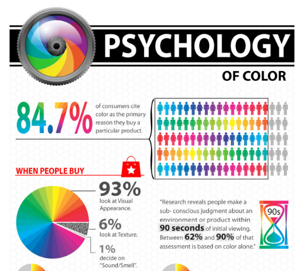
Image from Shortstack – See their website to see the full infographic.
What do colors mean to your viewers?
Red – Action, energy, strength, passion, fire, heat, power, attention-getting. Can also mean love and romance. A strong masculine color. Red is a good color for headlines and a call-to-action. Red is cheerfulness, excitement, and warmth. Pink is a soft version of red. It is most associated with romance, calming effect; a feminine color.
Blue – Confidence, travel, freedom, truth, professionalism, wealth, and power. Also tranquility, dependability, acceptance, patience, understanding, cooperation, comfort, loyalty, and security. It is one of the most calming colors and is associated with the sky and the sea, intelligence, reassurance, and trust. Blue has also been known to be an appetite suppressant, so it would not be good for cookbooks or recipes but you can consider it for diet books.
Green – Money, wealth, prosperity, calm, health, food, nature, hope, growth, freshness, soothing, sharing, and responsiveness. Green symbolizes spring, renewal, and fertility.
Orange – Health and vitality, autumn, youthfulness, fire, steadfastness, courage, confidence, friendliness, cheerfulness, warmth, excitement, and energy. Has been known to stimulate the appetite. Vibrant and warm, orange is associated with autumn and the earth.
Yellow – Light, purity, understanding, caution, brightness, intelligence, joy, organization, Spring. Yellow often represents sunshine, warmth, light, energy, and happiness.
Purple – Dignity, sophistication, creativity, spirituality, and mystery. Deep purple is associated with royalty, richness, and wealth while lavender is associated with romance and nostalgia.
Brown – Credibility, stability, the hearth, home, the earth, wood, comfort, and strength. Brown can be used as a neutral or warm color.
Black – Space, night, authority, dramatic, classy, committed, serious, power, elegance, and sophistication.
White – Purity, peace, perfection, freshness, ease, cleanliness, goodness, and spirituality. Worth noting here, white represents life and marriage in Western cultures, but it represents death and sorrow in Eastern cultures.
Grey – A conservative color, symbolizing security, maturity, and reliability.
Take advantage of the impact color can have on your Pinterest pin clicks and choose colors that will create positive responses.
Pinterest Design Tips
- Use vertical pins.
- Today, Pinterest recommends using 1000 x 1500 pixels is optimal – or any 2:3 aspect ratio, e.g. 600 x 900 px. However, many people report that longer pins work better.
- Use quality images and bright photos. Use stock photography. Free or paid stock photos.
- Target your pin design to your audience. For example, feminine colors may work well if your audience is female.
- Always add text over the image.
- Use easy-to-read fonts as Pinterest can read the text on your images.
- Use text colors that contrast with your background color or image colors to make them easy to read. Your easy-to-read headline must motivate people to click your pin.
- Use different colors in your text but no more than two or three colors.
- Bold colors work well but again, you have to keep your audience in mind.
- Canva is one of the best and easiest programs to design your pins.
- Create your own pins or outsource pin creation. If you have a challenge designing your pins, try using Pinterest templates.
- Avoid images with people's faces – many people report that they don't work well. But again, test it with your audience.
- Design multiple pins for your blog posts. Pinterest considers this new content. And it's a great way to test what works best.
Try Tailwind with the free Tailwind trial.
COLOR RESOURCES
ColorPick Eyedropper Chrome extension.
This eyedropper allows a selection of color values through its zoomed preview! It's a free Chrome extension.
Color palette generator, color wheel, and color palette ideas (https://www.canva.com/colors/) – Free resources from Canva (one of the best and easiest programs to design your pins).
The color wheel identifies complimentary colors by looking across the color wheel
Want a color scheme that perfectly matches your favorite images? With Canva’s color palette generator, you can create color combinations in seconds. Simply upload a photo, and we’ll use the hues in the photo to create your palette.
